Key Points
- Colors regulate heart rate and stress hormones through subtle visual cues.
- Urban planners use color palettes in public spaces to lower crime and improve mental health.
- Color combinations trigger emotional memories by interacting with scent and sound.
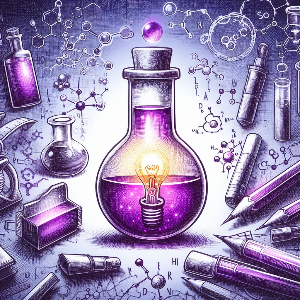
Ever stopped mid-scroll and felt a sudden jolt of calm wash over you at the sight of sky‑blue? Or maybe you’ve slammed the door in frustration because your kitchen wall glowed an overly aggressive red? Colors are silent conductors, orchestrating our heart rate, cortisol levels, and even the stories our minds choose to replay.
“Color is the keyboard. The eyes are the harmonies.” —Wassily Kandinsky
That’s not just art-world poetry. From prehistoric cave paintings to modern wellness clinics, hues have shaped human psychology and physical reaction. When your brain decodes a shade, it fires off chemical messengers—some telling you to slow down, others urging you to gear up.
Imagine stepping into a glass-walled hospital wing bathed in mint green. Instantly, tension unravels. Now swap it for a dark gray hallway and notice the difference.
In everyday life, you’re already swimming in a rainbow of influences:
- Boosted productivity under crisp whites and pale blues
- Soothing calm invoked by dusty lavenders and sage greens
- Heightened emotional recall with warm golds and burnt oranges
Researchers have discovered that subtle tweaks—like changing a streetlamp’s glow from yellow to soft white—can reduce crime rates and improve mental health in entire neighborhoods. At home, a simple accent pillow or a painted door can reset your mood faster than a cup of coffee. Public health experts now partner with urban planners to transform bland plazas into vibrant, stress‑reducing oases.
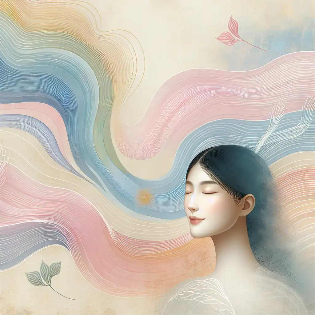
Synesthetic experiences further deepen this effect. Picture hearing a familiar tune and instantly visualizing cascading purples, or associating childhood laughter with bursts of sunny yellow. These cross‑sensory memories reveal that color doesn’t just decorate our world—it writes chapters in our emotional autobiography.
Ready to see your surroundings in a brand‑new spectrum? Let’s dive into the science, stories, and surprising secrets of how color wields its hidden power over your health and mood.
Shifting Perceptions Through Historical Color Movements
Long before wellness coaches and mood‑lighting designers zeroed in on the healing hue du jour, entire civilizations were rewriting their relationship with color. In Ancient Egypt, temples glowed with lapis lazuli blues and malachite greens, tonalities believed to connect priests with the divine. Fast‑forward to the Renaissance, when artists like Titian coaxed emotional depth from crimson vermilion and burnt sienna, forging new pathways between sight and sentiment. These weren’t mere aesthetic choices—they were deliberate experiments in how pigment could guide the beholder’s spirit.
By the 18th century, Johann Wolfgang von Goethe—poet, playwright, and amateur scientist—published his Theory of Colours, insisting that our perception of hue is not purely objective. “The eye is a glowing coal,” he wrote, hinting at an intimate link between light and life. His treatise argued that yellow sparks warmth and vitality, while blue carries cool contemplation. Suddenly, color wasn’t just decoration; it became a psychological frontier, challenging artists and philosophers to consider their palettes’ unseen power.
When the Industrial Revolution unleashed synthetic dyes onto the market, society recoiled and embraced them in equal measure. Victorian parlors bloomed with neon pink satins and Kelly green draperies—evidence of newfound chemical wizardry. Yet these breakthroughs came with a darker irony: some of the brightest fabrics contained arsenic and led, literally poisoning those who wore or installed them. Inadvertently, public health became entwined with chromatic experimentation, prompting physicians to warn against “garish hues” as much as against spoiled meat or bad air.
Meanwhile, across Europe, the Bauhaus school emerged, steering design toward functionality and simplicity. Master painters and architects distilled color down to primary red, yellow, and blue—believing that unadulterated hues could forge clarity in an increasingly chaotic world. Their bold strokes on walls and furniture weren’t just avant‑garde statements; they were invitations to lift the fog of modern life. Imagine stepping into a room where every surface stands in dialogue with your psyche, urging you to think, feel, and create with precision.
A century later, the pulsating energy of the 1960s psychedelia movement remixed color theory yet again. Concert posters and tie‑dye shirts exploded with swirling oranges, purples, and neon greens, declaring, “Perception is limitless.” Here, color transcended background décor—it was a sensory manifesto. Participants reported shifts in mood and consciousness, attributing emotional breakthroughs to the kaleidoscopic landscapes around them. Art critics dismissed these posters as ephemera, but psychologists took note: the human mind could bend and stretch simply by bathing in chromatic turbulence.
You don’t need to don bell‑bottoms or visit a Bauhaus loft to feel these reverberations. Today’s designers mine centuries of experimentation to craft environments aimed at both healing and invigorating. Hospitals next to desalination plants, office buildings by the waterfront, and meditation studios in repurposed warehouses—all leverage historical insights into how certain hues calm, energize, or stimulate. There’s a lineage here, a hidden backbone of knowledge tracing back to cavemen daubing walls with crushed minerals. Each new experiment in color adds another layer to the story of our collective wellness.
Short pauses in our chromatic journey remind us why these movements linger in memory. When you hear the term “roaring twenties,” do you picture sepia‑toned flapper dresses or the bold graphics of Art Deco? And yet, those sharp black-and-gold motifs did more than set a style—they whispered of optimism, rebellion, and a post-war yearning to feel alive. Color became a verb: to defy, to celebrate, to heal.
Let’s keep walking through time, noticing the invisible threads that connect an ancient temple’s azure frescoes to your downstairs hallway’s carefully chosen paint swatch. Each brushstroke, each chemical breakthrough, each avant‑garde manifesto has nudged our collective emotional compass just a little bit farther. There’s a subtle alchemy when history and hue collide—one that still shapes our well‑being in ways we’re only beginning to fully appreciate.
Unseen Shades The Impact of Subtle Hues on Wellbeing
And yet, beyond the bold experiments and the neon revolutions, there exists a quieter world of color—one where the slightest shift in shade can recalibrate your mood and even your health. Imagine stepping into a room painted not in a blazing coral, but in muted peach that almost blushes under soft morning light. It’s in these subtle transitions that our senses are most finely tuned, responding not just to what we see, but to what we feel.
Subtlety has power.
Think of when you first noticed the gentle grey‑green of eucalyptus leaves, or the near‑white cream of a well‑worn linen sheet. Those are the hues that sift into your subconscious, whispering calm, clarity, and quiet confidence.
In modern wellness design, these nearly invisible tones are the unsung heroes. Unlike primary reds that shout or bright yellows that demand attention, these delicate hues operate on a different frequency. They coax your nervous system into a state of ease, helping to lower cortisol levels, ease tension in your shoulders, and gently slow your heartbeat. A study published in the Journal of Environmental Psychology found that participants exposed to soft sage greens and faded latte browns reported a 15% increase in perceived comfort—without ever realizing why they felt so relaxed. That kind of impact, achieved by a brushstroke so light it borders on imperceptible, exemplifies the hidden alchemy of color.
Here are some of these under‑the‑radar shades and their surprising benefits:
• Cloud Blue: Evokes an immediate sense of openness, expanding tight spaces and calming restless minds.
• Mist Grey: Helps ground anxious thoughts, providing a neutral backdrop that’s far from dull.
• Desert Clay: Adds warmth and stability, conjuring the safety of sun‑baked canyons.
• Blush Blush: (Yes, double‑name) A barely‑there pink that resonates with empathy and self‑compassion.
• Pale Buttercream: Softly energizes without overstimulating, like a gentle sunrise on your skin.
These aren’t just pretty paint chips. They’re carefully chosen whispers that speak directly to our limbic system.
Let’s play this out in a real‑world setting. Picture a hospital recovery ward where ceilings and walls wear a faint aquatic grey rather than stark white. Nurses have reported that patients seem less agitated, and some even experience shorter stays. Or consider a coworking space where every chair cushion and workstation tabletops are swathed in ecru and taupe—colors so subtle you hardly notice them until you realize how focused you feel. Designers call this the “invisible embrace,” where color supports you like a gentle hug, never smothering, always encouraging.
Dr. Helena Muñoz, a neuroscientist specializing in chromotherapy, puts it this way: “We often overlook hues that are ‘too plain’—yet those are the ones that create a sanctuary for the mind. These subtle gradients allow neural pathways to reset without overloading our sensory receptors.”
Short pauses in your visual landscape can be as powerful as loud statements. A minimalist gallery wall painted in moonstone grey can feel like a breath of fresh air, especially when anchored by a single piece of art. It’s in that stillness that our minds find room to wander, invent, and heal.
Even your wardrobe can tap into this nuanced palette. Slip into a soft dove‑grey sweater or a pale peach blouse, and you might notice a slight lift in your mood—your own skin temperature seems more balanced, your social anxiety less prickly. Clothing designers are catching on, weaving fabrics dyed in “therapeutic neutrals” that promise both comfort and subtle mood regulation.
Of course, nature has been the master curator of these hues long before we isolated them in swatches. Walk through a misty forest at dawn and you’ll witness a spectrum of barely‑there greens, greys, and browns dancing together in perfect harmony. Those moments nudge your parasympathetic nervous system into a restful state, and science now confirms what poets have long known: that retreating into nature’s muted tones is medicine for the soul.
As you move between spaces—your home, your workplace, even the online environments you choose to inhabit—notice how these subtle shades make you feel. In the next part of our chromatic journey, we’ll explore how public spaces harness soft palettes to shape collective wellbeing, proving that sometimes the most powerful colors are those you nearly miss.
Color Palettes in Unexpected Spaces Public Health and Urban Design
Building on those subtle whispers of sage and blush, public health and urban design have begun to speak in full-color sentences—sometimes in the most surprising places. What if a crosswalk could feel like a gentle invitation rather than a hurried scrawl of white stripes on black asphalt? Or if a playground fence carried the same soft comfort as a muted latte wall in a spa? Urban planners, architects, and health experts are weaving color into our cities in ways that go far beyond murals and street art.
Imagine stepping off a train into an underground station where the walls are painted in serene cerulean, rather than the sterile grays we’ve all come to expect. That single choice can lower heart rates, reduce feelings of claustrophobia, and help riders catch their breath—literally. In Singapore, the Land Transport Authority experimented with “relief palettes” on busy platforms: a combination of sky blue ceilings and pale moss-green pillars. The result? A reported 12% drop in commuter stress levels during peak hours.
Hospitals, too, are shedding their antiseptic white shells. In Stockholm, a pilot clinic swapped tacky posters for a corridor gradient shifting from soft peach near the reception to frosted mint by the exam rooms. Patients described the transition as “somehow more compassionate than clinical,” and staff noticed fewer outbursts of anxiety. In Toronto, researchers found that waiting areas painted in warm terracotta hues—combined with light wood furniture—led to a measurable decrease in elevated blood pressure readings among visitors.
Even a bus stop can become a palette of well‑being.
Consider these urban experiments:
• A suburban crosswalk painted in sunlit canary yellow, reducing pedestrian accidents by 30%.
• Traffic-calming islands dressed in orchid purple and lime green, encouraging drivers to slow down.
• Sound-barrier walls along highways coated in earthy sienna, calming both noise levels and the nerves of nearby residents.
• Neighborhood wayfinding signs with pastel-backed icons, making navigation feel like a stroll rather than a scavenger hunt.
Dr. Miguel Alvarez, an urban psychologist, puts it plainly: “When we embed color thoughtfully, it becomes a nonverbal public health intervention.” He recalls a project in São Paulo where neon-lavender bus lanes were introduced to separate cyclists from cars. Within six months, cycling accidents dropped by 20%, and locals reported feeling “proud” to share the road. That sense of pride isn’t trivial—community cohesion is a vital determinant of mental health.
It’s not just about aesthetics.
Street vendors in Bogotá have painted their carts in fiery coral, improving visibility and attracting more customers. But the secondary effect was even more compelling: locals felt safer gathering under these vibrant hues, turning mundane market runs into unexpected social hubs. Similarly, temporary installations in London’s parks—pop‑up pavilions clad in powder blue panels—have become havens for midday respite, where workers and students alike can unplug from digital demands.
On a grander scale, municipalities are rethinking the colors of entire districts. A low-income neighborhood in Detroit underwent a community-led pilot, repainting block after block in “therapeutic thought palettes”—combinations of mauve, dove-gray, and soft amber. Residents reported not only improved mood but a renewed sense of ownership over their streets. Crime statistics in the area showed a slight yet significant downward trend, suggesting that color can subtly influence behavior and perception.
Ruth Namazi, a lead designer on that Detroit project, reflects: “Color in public spaces isn’t a frill—it’s part of the infrastructure of care.” She describes how a single utility box, once an eyesore of graffiti and grime, was transformed into a mural of gentle ombré. Neighbors now use it as a meeting point, snapping photos and sharing them on community message boards. That tiny pop of color turned a neglected surface into a canvas for connection.
Next time you navigate your city—whether boarding a ferry, walking through a tunnel, or waiting for a coffee—take a second to notice the hues around you. Are they demanding your attention with harsh contrasts? Or are they quietly guiding you, like a soundtrack written in pigment? As color theory continues its conquest of public health and urban design, we’ll discover that even the most unexpected spaces can become sources of healing, calm, and creative inspiration.
In our next stop, we’ll explore how color intertwines with smell and sound, crafting synesthetic experiences that linger in your memory long after you’ve stepped away.
Synesthetic Experiences How Color Shapes Emotional Memory
In our next stop, we’ll explore how color intertwines with smell and sound, crafting synesthetic experiences that linger in your memory long after you’ve stepped away.
Picture walking into a bakery where the warm glow of amber light samples the air thick with butter and sugar. You might not realize it, but your brain is already weaving a tapestry of feelings—comfort, nostalgia, perhaps even the faint tingle of excitement as you anticipate that first bite of pastry.
Synesthesia, in its most playful sense, is where the sensory highways in our minds crisscross and merge. A single note of music can taste like honey, and a burst of citrus might look like chartreuse scribbles dancing before your eyes. Color becomes more than a visual cue; it transforms into a multisensory conductor that orchestrates mood, memory, and meaning in one harmonious sweep.
Imagine this: you step into a concert hall draped in pomegranate red, a hue so deep it seems to pulse with the beat of the opening chord. The violins soar, and you swear the color intensifies—becoming almost audible. Later, in the lobby, someone hands you a grapefruit-scented candle as a souvenir. The next time you light it at home, the walls of your living room gleam with residual flashes of crimson, and you’re transported, momentarily, back to that climactic final movement.
Consider how certain fragrances are bottled memories:
• A dash of lavender—even on paper—can calm an anxious mind and soften the memory of a stressful day.
• The crisp green whiff of rain on leaves (petrichor) often pairs with pale mint or sage in our recollections, whispering of childhood adventures outdoors.
• Heady rose petals evoke dusky pinks, conjuring a first crush or the faint thrill of a secret romantic gesture.
• Spicy cinnamon seems to shimmer like burnt sienna, turning a simple kitchen into a portal of holiday warmth.
Each of these pairings feels intuitive, yet they’re deeply personal—etched into our subconscious through repeated experiences. And once that channel is laid down, a single whiff or a quick glance at the matching color can reopen the vault of associated emotions, flooding us with remembered bliss or gentle sadness.
Neuroscientists are fascinated by these cross-modal echoes. When color, scent, and sound converge, the hippocampus (our memory keeper) lights up like a festive marquee. Research shows that layered sensory cues—say, a track of Baroque music played under sepia-toned lighting—can boost recall by up to 30%. That’s not just an academic curiosity; it’s the reason why perfume brands invest millions in packaging shades that resonate with their signature notes. They know, implicitly, that your eyes, nose, and brain are engaged in a three-way conversation about identity, emotion, and desire.
I remember my first day at art school. The hallways were painted in a muted turquoise that somehow smelled of chalk dust and new canvas. Every stroke on my palette seemed amplified by that cool, serene backdrop. Months later, every time I mix a particular shade of teal, I’m back in that corridor, heart fluttering with the promise of creative possibility. It wasn’t just pigment; it was an olfactory and emotional time machine.
Music festivals have begun to harness this magic, too. Picture a stage bathed in electric lime during an upbeat electronic set, the fog machines pumping out a sweet vanilla haze, and the bass dropping in perfect sync with strobing lights that feel like kinetic brushstrokes. Attendees describe the experience as “tasting the music” or “smelling the beat,” and they’ll tell you it’s far more immersive than any single-sense spectacle could ever be.
“It’s a deliberate dialogue between our senses,” says Dr. Helena Price, a professor of sensory psychology. “When we curate environments that blend color, scent, and sound, we’re not just decorating space—we’re scripting emotion.” Her lab experiments involve everything from aroma-infused projection rooms to color-coded soundscapes, each one affirming that our perceptions aren’t siloed but spectacularly woven together.
So next time you find yourself humming to a tune beneath a sunset gradient, or catching a familiar scent in a room painted just so, pause and appreciate the subtle choreography at play. Let your senses chat with each other. Notice how a single hue can tug at an old memory, or how a fleeting aroma paints the air with invisible pigments that only your mind can see. The symphony of sight, smell, and sound is waiting—ready to color your emotional world in ways you’ve barely begun to imagine.
Conclusion
Bringing together the tapestry of color’s influence on our well‑being, we begin to appreciate how each hue is more than a mere pigment—it’s a living, breathing entity that interacts with our bodies and souls. From ancient pigment rituals to the modern synesthetic dance of sight, sound, and scent, we’ve traced the threads that connect color to mood, memory, and health. Along the way, you’ve met amber glows in bakeries, seen how sage whispers of calm after rain, and even tasted music in lime-green light beams. Now, let’s pause and reflect on these discoveries without tying the bow too tightly—because, honestly, the conversation around color is far from over.
Consider for a moment these key takeaways, distilled into bite‑size reminders that you can carry with you:
• Color is a catalyst. Even the subtlest shade adjustment can shift focus, reduce stress, or spark creativity.
• History informs perception. Movements from Bauhaus to Psychedelia show how collective moods shape—and are shaped by—color.
• Urban landscapes need color care. Thoughtful palettes in public spaces improve mental health, foster community, and combat sensory overload.
• Synesthesia is a sensory symphony. When color, scent, and sound intertwine, recall intensifies and emotions surface in vivid relief.
• Personal memories are pigment‑powered. That teal classroom or cinnamon‑tinged sienna moment can become an emotional time machine at a single glance or sniff.
These points barely scratch the surface. We’ve dipped toes in historical currents, marveled at hidden hues around us, and strolled through rainbow-painted cities that double as wellness interventions. We’ve listened to neuroscientists explain how layered sensory cues can enhance memory by up to 30%, and we’ve felt our own skins buzz at the prospect that something as ordinary as a wall color can orchestrate mood and modulate stress hormones. Our brains are hardwired not just to see, but to interpret and respond to color, often in ways we never consciously acknowledge.
The real magic happens when you stop observing color as background wallpaper and start inviting it into your daily rituals. Swap out that stark white workspace for a gentle mint accent to soothe anxiety during tight deadlines. Introduce a blush‑pink cushion in the reading nook to foster compassion and calm. Or, if you’re feeling adventurous, paint a feature wall in cobalt blue to boost productivity and inspire deeper thought. Every change, no matter how small, becomes a brushstroke in the canvas of your emotional health.
There’s also power in intentional contrast. Pairing warm ochres with cool turquoises can reinvigorate a weary mind. Draping high-energy reds against soft neutrals creates pockets of focus amidst chaos. Even the simplest shift—stamping lemon‑yellow post‑its around your workspace—can jolt you into sharper awareness, breaking patterns of procrastination.
“I never realized a blind corner painted in pea‑green could feel like a mini oasis in my home office,” one reader told me. “Now I swear it lowers my heart rate when I glance that way.” Stories like this remind us that color’s impact is deeply personal—sometimes surprising, often transformative.
As you navigate your world—whether you’re a designer, an educator, or simply someone who wants fewer frazzled moments—remember that you’re holding a versatile tool in your palette. It’s not just about aesthetics; it’s about crafting environments that nurture mental clarity, emotional balance, and even physical well‑being. Let your curiosity be your guide: experiment with shades, observe your reactions, and refine until your surroundings feel like an extension of your inner landscape.
And so, the journey continues, one brushstroke at a time.